The Card in the Wallet Test: What Makes a Business Card Worth Keeping
There's a simple test every business card has to pass: a week after you hand it out, is it still in someone's wallet? Or has it been shoved into a pocket, run through the laundry, and tossed with the receipts?
Most cards fail that test. Not because the business behind them is bad, but because the card gives people no reason to hold onto it. The good news is that the difference between a keeper and a throwaway comes down to a handful of decisions — and none of them require a design degree.
Start With Paper, Not Pixels
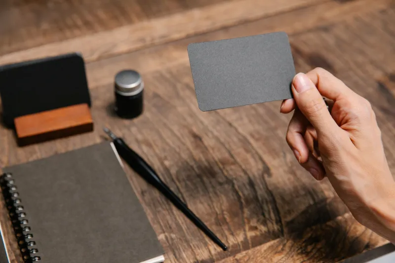
Here's the thing most people get backwards: the first thing anyone notices about a business card isn't the design. It's the feel. A flimsy 80 lb. cover stock bends in the hand and quietly announces, "I cut corners." A 16 pt or 32 pt thick stock with a bit of heft makes the recipient pause for half a second — and that pause is where impressions happen.
If you really want to make an impression, consider a soft-touch laminate or an uncoated cotton stock. Texture is memorable in a way no font ever will be.
The Layout Rule: One Job Per Side
Cramming a logo, tagline, address, fax number (nobody has a fax number anymore), and a QR code onto one side produces visual noise, and noise gets discarded. The winning formula is simple:
- Front: Name, business, primary contact. That's it.
- Back: Your logo, a single tagline or offer, and — if it makes sense for your trade — a QR code that goes somewhere useful, like a booking page.
A plumber might put "24/7 emergency service" on the back. A photographer lets a striking image do the talking. One idea per side, always.
Finish and Shape: Earn the Pause
Finishes are where personality shows up. Spot UV gloss on a matte background makes a logo literally catch the light. Foil stamping — copper and gold tones especially — reads as premium without shouting. Painted edges on thick stock are the kind of detail that makes someone show the card to a friend.
As for unconventional shapes: use them sparingly and with purpose. A rounded-corner card survives in a wallet better than sharp corners. A card die-cut into the shape of your product (a cupcake, a key, a guitar pick) gets kept as a curiosity — but only if the contact info is still legible. Gimmick first, function second, and you've wasted the print run.
Color Choices That Age Well
Trends move fast; cards last years. Neon gradients that look fresh today can feel dated by the time you've handed out the last hundred. Stick with a restrained palette — two or three colors max, with one bold accent. Deep navy, forest green, terracotta, and warm grays all photograph well, print cleanly, and won't embarrass you in 2028.
And please, check contrast. Light gray text on white cardstock might look elegant on your monitor and unreadable under restaurant lighting.
Small-Business Cards That Get It Right
Think of the cards you've actually kept. A woodworker's card printed on lumber-adjacent textured stock. A realtor's card with her headshot and a magnetic-back version stuck to the fridge of half the neighborhood. A food truck's card that doubles as a punch card for a free taco. In every case, the card does more than list contact info — it demonstrates what the business is like to work with.
Don't Skip the Print Proof
Digital proofs lie. Colors shift between screen and press, thin fonts can close up at small sizes, and what looked balanced on your phone can feel cramped at 3.5 x 2 inches. Always request a hard proof or a short sample run before committing to a full order. A few extra days and a few extra dollars beat 1,000 cards you can't hand out.
The Takeaway
Your business card is the only piece of marketing most people will physically hold before they ever hire you. Give it some weight, give it one clear job per side, and pick a finish that makes the moment of receiving it feel like something. Do that, and you'll pass the wallet test — which is the only test that counts.