Eighteen by Twenty-Four: The Sign That Sells While You Sleep
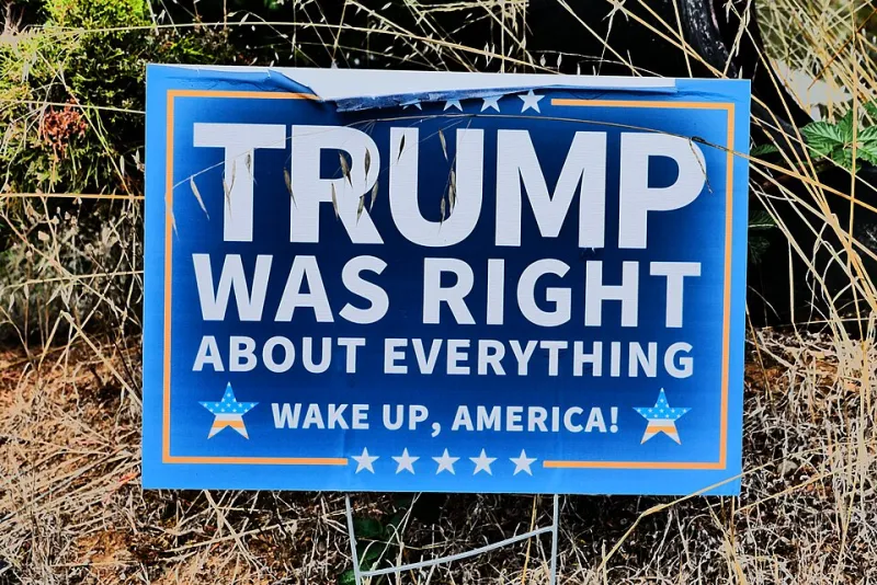
Photo: Rick Obst, CC BY 4.0, via Wikimedia Commons
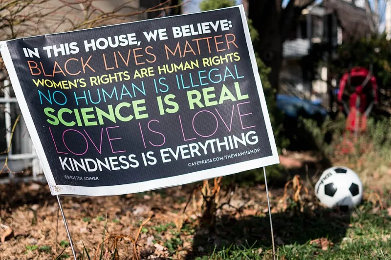
Drive through any American subdivision on a Saturday morning and you'll see the same thing: a dozen yard signs fighting for attention, most of them losing. The realtor's sign blends into the hedges. The landscaper's phone number is too small to read at any speed. The garage sale sign is a white sheet of paper that gave up sometime around Tuesday.
And then there's that one sign — big, bold, impossible to miss — that you read the entire way through the intersection, whether you meant to or not.
That sign wasn't luck. It was math.
The 35 MPH Problem
Here's the number that changes everything: a driver moving at 35 miles per hour covers about 51 feet every second. Research on driver attention suggests most people can spare somewhere between three and six seconds of glancing time for anything that isn't the road.
Do the arithmetic. Your sign has roughly two seconds of real readability — less if there's traffic, less still if it's raining. That means every word on your sign needs to earn its place, and most words don't.
A good test: have a friend hold your design up for two seconds, then hide it and ask what it said. If they can't tell you the name and the one thing you do, the sign fails. It doesn't matter how pretty it is. Pretty doesn't sell landscaping contracts. Legible does.
Contrast Beats Cleverness, Every Single Time
Writers want to be witty on yard signs. Designers want to use that trendy thin font from the mood board. Both are wrong for this medium.
A yard sign is read in periphery, at speed, often against a cluttered background of grass, siding, and parked cars. What wins in that environment isn't personality — it's contrast. Dark letters on a light background, or the reverse, with nothing subtle in between. The classic red-white-and-blue political sign isn't iconic because of patriotism alone; it's iconic because those color combinations punch through almost any backdrop in any season.
A few rules that hold up across every neighborhood in the country:
- One message. Name and service. Maybe a phone number. That's it.
- Letters sized for the street, not the sidewalk. If your sign sits 20 feet from the road, the main text should be readable from 100 feet or more.
- Skip the script fonts. Cursive looks elegant at a trade show and looks like static at 35 mph.
- Leave breathing room. A sign crammed edge to edge reads like noise. White space is what makes the message land.
Placement Is Half the Design
The best-printed sign in the world fails if it lives in the wrong spot. Placement psychology is where the pros quietly pull ahead.
Intersections with stop signs are gold — drivers are stopped, bored, and looking for something to read. The approach to a neighborhood entrance catches every commuter twice a day. Corners where the road curves naturally slow traffic and pull eyes outward.
Height matters too. A sign planted low in tall grass gets swallowed. Eighteen to thirty inches up, angled slightly toward oncoming traffic rather than flat to the road, gives you the best sightline. And if you can get permission for the corner lot facing the busiest street? That single placement can outperform five signs scattered around the subdivision.
What the Dominators Do Differently
Watch the real estate agents and contractors who seem to be everywhere in a given zip code, and you'll notice patterns:
They commit to one design and repeat it. Same colors, same layout, same font, sign after sign after sign. Repetition builds familiarity, and familiarity builds trust. A voter, a seller, or a homeowner who's seen your sign nine times this month already feels like they know you.
They use the sign as proof of work. The landscaper who plants a sign at every job site isn't just advertising — they're showing a portfolio to the entire block, one driveway at a time. Every finished lawn becomes a billboard for the next job on the street.
They order weatherproof and they order enough. Coroplast — that fluted plastic board behind almost every yard sign you've ever seen — exists because it shrugs off rain, sun, and a Midwest winter without warping or fading. A sign that goes gray and droopy by August makes your business look the same way.
They include one clear action. A phone number big enough to dial from the driver's seat, or a QR code for the parked-car crowd. One action, clearly stated. Not three ways to get in touch competing for attention.
Small Sign, Serious ROI
Here's the part that gets overlooked: a well-designed 18x24 coroplast sign with a simple wire stake costs less than a nice dinner out. If it sits in a high-traffic spot for 60 days, it might make several thousand impressions a day. Work out the cost per view and nothing in your marketing budget comes close.
Compare that to a digital ad that gets scrolled past in half a second, or a mailer that goes straight to the recycling bin. The yard sign just stands there, day after day, quietly doing its job. Rain or shine.
So before you order your next batch, run the two-second test. Check your contrast. Scout your corner lots. The humble lawn sign has been winning elections, selling houses, and filling contractor calendars for decades — but only for the people who treat two square feet of corrugated plastic like the serious marketing asset it is.
Design it like you've got two seconds. Because you do.