The Silent Salesperson on Every Table: How Your Menu Talks Diners Into Ordering More
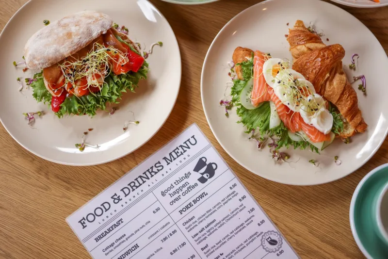
Walk into any diner in Ohio, any taco spot in Austin, any bistro in Portland, and you'll see the same scene: a guest picks up the menu, scans it for maybe ninety seconds, and orders. That's it. Ninety seconds to make an impression that determines your average ticket, your margin, and whether that table ever comes back.
Yet most restaurant owners treat their menu like a receipt — a flat list of dishes and dollar signs. The truth is, a printed menu is closer to a salesperson. And like any salesperson, it's either upselling for you or talking customers out of spending.
The Paper Tells a Story Before the Food Does
Here's a trick you can try tonight. Hand a guest a menu printed on flimsy copy paper, then hand them one on a heavy, soft-touch stock. Ask which restaurant feels more expensive. It's almost never close.
Weight and texture do subconscious work. A 100# cover stock or a thick uncoated sheet signals craft — it says the kitchen cares about details, so the details on the plate probably do too. Thin, glossy, laminated menus say fast-casual, which is fine if that's your brand. The mistake is a $28 entrée on a menu that feels like a takeout flyer. The paper and the price are contradicting each other, and diners believe the paper.
You don't need to gold-emboss anything. A heavier stock, a matte finish, and clean edges get you most of the way there for pennies more per unit.
Size Matters (Your Type, Specifically)
Somewhere along the way, restaurant menus got tiny. Four-point fonts crammed into a tri-fold so the whole operation fits on one sheet. It saves on printing costs and costs you orders.
If a guest has to squint — or worse, pull out their phone flashlight under your dim romantic lighting — you've added friction at the exact moment they're deciding to spend money. Older diners, a huge chunk of the American dining public, simply skip what they can't read. Every illegible item is a dish that never sells.
Aim for body type that's readable at arm's length in low light. If your designer sends proofs, look at them in the actual dining room, under the actual bulbs, before approving anything.
The Layout Is Doing the Selling
Menu psychology has a well-worn playbook, and most of it holds up:
- The first thing seen gets ordered. Eyes land on the top-right corner or the center of a single-page menu first. Put your highest-margin item there.
- Remove the dollar signs. Studies going back years show guests spend more when prices read as "14" instead of "$14.00." The symbol triggers pain-of-paying math; the bare number reads as just another detail.
- Anchor with a high price. That $42 steak isn't there to sell steaks. It makes the $26 dish beside it feel reasonable. Every menu needs a decoy.
- Boxes draw eyes. A simple bordered box around two or three items — your profit leaders — outperforms any star or "chef's pick" icon.
- **Descriptions sell, adjectives bore. "Slow-braised short rib, bourbon glaze, smoked gouda grits" beats "delicious, amazing, mouthwatering" every time. Name the ingredients; let the guest imagine the flavor.
None of this requires a redesign from scratch. Often it's a reshuffle of what you already have.
Don't Print Everything — Print Smart
The biggest fear owners have about menu changes is the reprint cost. Fair. Menus get stained, torn, and outdated the moment you change a supplier. But there's a middle path between "never update" and "full reprint every quarter":
- Separate your stable from your volatile. Core dishes rarely change; specials and prices do. Print the core menu on durable stock, and run your specials on cheap insert cards or table tents. Update the inserts weekly for a few dollars.
- Print short runs. Digital printing means 100 beautiful menus is a realistic order, not 5,000 laminated ones you'll be throwing away in 2029. Change a price? Reprint next month instead of living with it for two years.
- Test before you commit. Print two layout versions, run each for two weeks, and compare ticket averages. Your POS data will tell you which menu is the better salesperson.
The Feel Test
One last thing, because it matters more than most owners believe: hand your own menu to a friend and watch their face. Does it feel substantial? Does it wipe clean? Does it fall open to the right page? Is anything sticky?
A menu is the one piece of marketing your customers hold in their hands, study, and touch for minutes at a time. Business cards get glanced at. Mailers get tossed. Menus get read.
Give it the weight, the type, and the layout of something worth reading — and it'll quietly do the upselling while you run the kitchen.