Hold It In Your Hand: The Finish That Decides Whether Customers Keep Your Print
Photo: Rhetos, CC0, via Wikimedia Commons
Every piece of print that leaves our shop goes through the same final question: what's it going to feel like?
Most business owners never think about it. They sweat over the logo, rewrite the tagline three times, pick a font — then click "matte" because it's the default or "gloss" because it sounds shiny. But the finish is the handshake. It's the first physical thing a customer knows about you, and unlike your headline, they can't skim past it.
So let's get hands-on about the three big players: matte, gloss, and soft-touch lamination.
Matte: The Quiet Confidence Play
Matte coating scatters light instead of bouncing it back. What that means in practice: no glare under fluorescent lighting, no fingerprints, and text that reads clean even when someone's standing in a hardware store under harsh overheads.
Matte says established. It's the finish of law firms, architecture studios, financial advisors — anyone who wants to signal "we don't need to shout." A matte business card feels like a book jacket rather than a candy wrapper.
When matte wins:
- Business cards for service pros — accountants, consultants, contractors. Anything where trust beats flash.
- Brochures with lots of text. Gloss can make long paragraphs harder to read under certain light. Matte keeps the words comfortable.
- Anything that gets handled a lot. Matte hides smudges from hands and pockets.
The one warning: cheap matte stock can feel flat, almost papery. Matte works best on a heavier card stock — 14pt or thicker. Thin matte feels like a flyer; thick matte feels like an invitation.
Gloss: When You Want the Sale, Not the Relationship
Gloss is the extrovert. It makes colors pop, photos look saturated, and reds genuinely red. If your print is doing a job — announcing a sale, showing off a food photo, getting noticed on a crowded rack — gloss is your finish.
Think about the last restaurant mailer you got. The burger practically glows. That's gloss doing its job.
Where gloss earns its keep:
- Rack cards and travel brochures. On a rack in a visitor center, glossy wins the eyeball contest every time. It reflects light and pulls attention from six feet away.
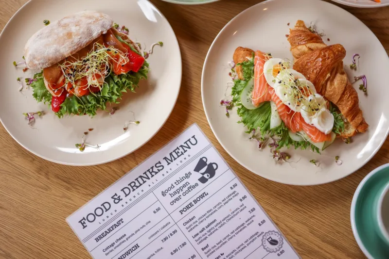
- Menus with photography. Gloss makes food look appetizing, full stop.
- Event flyers and sale promotions. Short shelf life, high visual impact — gloss is built for that.
The tradeoff: gloss shows every fingerprint, and it can feel a little mass market. A glossy business card can read as "these get printed by the thousand," which is exactly the wrong message if you're a boutique studio or a craftsman.
Soft-Touch: The One They Can't Put Down
Here's the finish that surprises people. Soft-touch lamination adds a velvety, almost suede-like layer — and the effect on customer behavior is genuinely strange. People rub it. They hand it to a coworker. They keep it.
We've watched it happen at trade shows: two nearly identical cards on a table, and the soft-touch one is the one that disappears. There's real psychology behind it — a novel tactile sensation triggers longer handling, and longer handling means more time with your brand in someone's hand and head.
Soft-touch is right for:
- Premium business cards. If your average client is worth thousands, a card that costs a few cents more is a rounding error.
- High-end brochures and lookbooks. Real estate developers, wedding vendors, luxury services.
- Anything you hand-deliver. The tactile wow lands hardest in person.
Two honest caveats: soft-touch costs more, and dark soft-touch finishes can show scuffs if they're rattling around a wallet for a year. It's a statement finish, not an everyday-workhorse finish.
Quick Matching Guide
Still stuck? Match the finish to the job:
| Piece | Best Default | Why |
|---|---|---|
| Business card (services) | Matte on thick stock | Understated, durable, readable |
| Business card (premium/luxury) | Soft-touch | Memorability, keepability |
| Brochure (informational) | Matte | Easy on the eyes for reading |
| Brochure (photo-heavy) | Gloss | Makes images sing |
| Rack card | Gloss | Visibility on the rack |
| Menu | Gloss (laminated) | Wipeable, food photos pop |
| Event flyer | Gloss | Cheap, loud, effective |
One Last Thought
If you can, order a sample pack or ask to feel finished pieces before you commit. Describing finishes in a blog post is like describing coffee by email — you really have to taste it.
The finish you choose won't close a deal on its own. But the wrong one can quietly undercut everything else you got right. Pick the texture that matches the story you're telling, and your print will do more than get seen. It'll get kept.